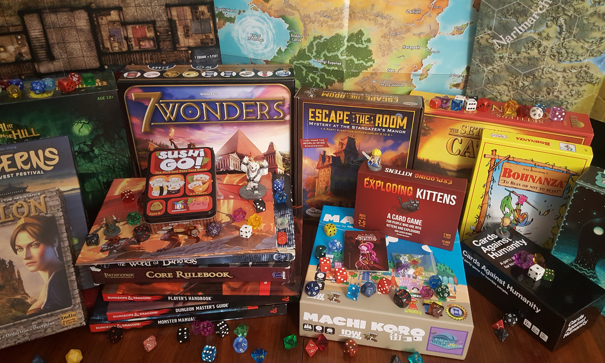

Today on Save Vs. Rant, we’re discussing the first module of Rise of the Runelords, the first adventure in Pathfinder’s Adventure Path series set in the Pathfinder Roleplaying Game Setting. Why would we review an Adventure Path from 2007 (re-released in 2012)? Not only because of the insight it gives us into the mentality professional game designers creating memorable adventures, but also as a retrospective on Paizo Publishing’s masterful Adventure Path series!
But given that this blog is not intended to just reiterate what we say in the episode, I don’t want to spend this entry gushing about the Adventure Paths. Instead, I’d like to talk about the art of Pathfinder, and what I consider to be the regrettable side effects of good art direction.
There’s a lot to be said for having a consistent art style. In a cartoon, graphic novel or other strictly visual medium, anything that diverges from a strict interpretation of the series’ art style can be jarring. Even minor variations on art styles are likely to be treated as cardinal sins by dedicated fans.
But a roleplaying game is primarily displayed in the imaginations of the players, and visual aids such as illustrations and miniatures are just that – aids, not moment to moment reflections of the events of the game. While holding to a single art style or an exacting degree of realism might be appropriate, I’ve always appreciated when roleplaying sourcebooks include the work of several artists. White Wolf’s World of Darkness series has sourcebooks that all features diversity of artistic styles. A lot of the older Pathfinder material, likewise, features artists with wildly different styles.
Compare, for example, these images of Aldern Foxglove from Burnt Offerings:
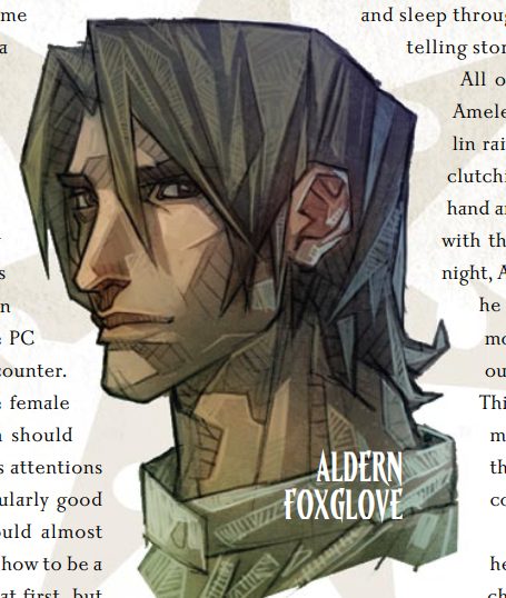
I mean, I get it. It’s hard to argue that the new version isn’t “better” art in the sense that it’s more detailed and realistic, but Arnold Tsang’s art on the left has a stylistic appeal to me, partially because it’s not an extremely detailed rendering. Partially because it has a cartoon aesthetic that makes it feel somewhat fantastic to me.
Likewise, consider these illustrations of Koruvus, a mutant goblin from the same module:
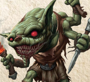
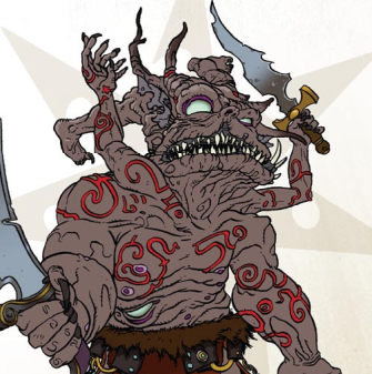
And, once again, I understand why the editor would choose to go with the illustration on the left. The one on the right goes so far as to largely disregard the design elements of a goblin (bulbous head, green skin, beady red eyes) and seems to draw some sort of deformed saggy-skinned orc-thing in its place. But one thing I do like about it is how miserable the creature seems – it’s so far lost from being a whimsically and sadistically euphoric goblin that the wretchedness of this thing is palpable.
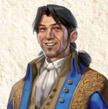
Ok, one more:
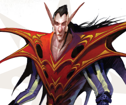
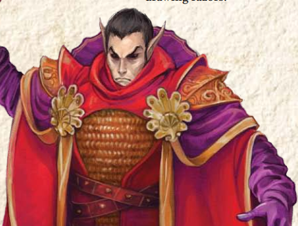
Ok, I get it. I really do. The one on the left is almost absurdly silly in presentation, while the one on the right is largely the same character portrayed in a much more serious tone. And as a major boss in the second module, it’s understandable to want to present the character seriously. But, to me, part of what makes this interesting is the portrayal of such a serious threat to the campaign in such a whimsical costume. Honestly, both of them are dressed in ridiculous ceremonial garb, but on the right an attempt is made to portray the outfit as serious and realistic, while on the left, no effort is made whatsoever to make the over-the-top nature of the costume presentable. Honestly, I think that goes a long way toward contrasting the ridiculous appearance against the dangerous enemy.
And now that I’ve complained about consistency in art, how about I change gears and complain about the opposite of that? Pathfinder’s line of paper miniatures largely seemed to want to maintain a semi-consistent art style, featuring primarily arts with bold dark lines, lower levels of detail, heavily blended colors and relatively simple shapes, all of which compliment the idea of paper miniatures. The artists tapped for the project, however, all have substantially different approaches to this, Ashton Sperry, being my favorite, followed by Crystal Frasier, Todd Westcot, and lastly (no offense) Callous Jack. Even the worst of the paper minis products is worth using and actually pretty good, but the disappointment of my favorite paper miniature artist cycling off the project, coupled with the fact that they didn’t finish minis for several of the adventure paths was a substantial disappointment, quite frankly.
Maybe it’s my inner grognard complaining about changes being made to the face of the campaign (and my small army of paper minis). Maybe I’m weird to like unusual art styles that clash with one another. Maybe I just like seeing lots of different art styles and will use basically any excuse to see lots of different art styles. Whatever the case, I hope that unique artists and unusual art will continue to periodically make appearances in Pathfinder material – as well as that of other RPGs.
Next episode, we’ll look at the second module, The Skinsaw Murders. Stay tuned!